library(tibble)
library(ggplot2)
library(ggthemes)- 0
-
The data used for the illustration is created by hand [
tibble()]. - 1
-
This is a package with cool themes for
{ggplot}. I’m using it below only for an aesthetic suggestion, so no real need.
“Small multiples” is a design principle for data visualizations advocated by Edward Tufte. I won’t describe the principle in detail, and even less present the work of a master in the field.
Suffice to say that there is no serious discussion about the display of quantitative information without a reference to E. Tufte—a.k.a. “The Leonardo da Vinci of data” (NYTimes) and “The Galileo of graphics.” (Bloomberg). So, disregard his principles at your own peril!
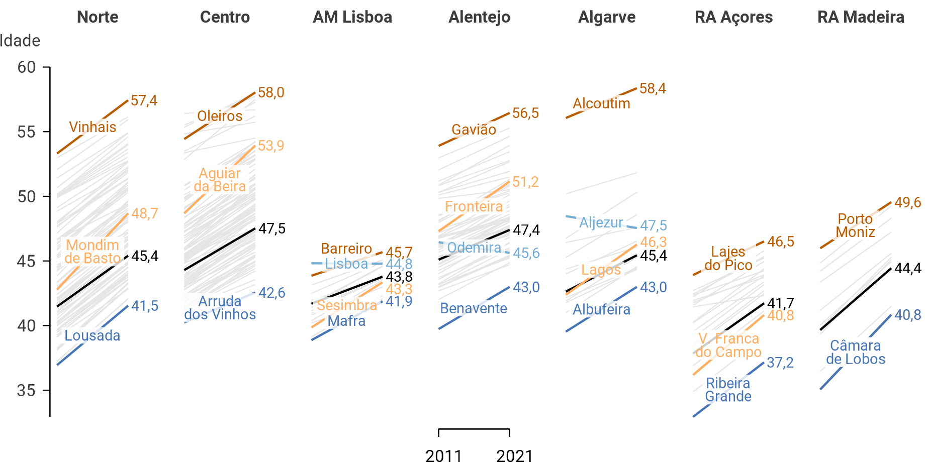
This page of the Pew Research Center has illustrations of the principle. Figure 1 shows an example published by Statistics Portugal with the last census data—okay, full disclosure: I did it for them.
“Small multiples” refers to the process of dividing a plot into multiple smaller subplots based on one or more categorical variables. They are typically dense in data. But the division of the data into subsets makes it easier to compare patterns and trends across different groups.
Thus they are particularly useful when exploring relationships between variables while considering the influence of categorical factors.
In {ggplot2}, the process is called facetting. It is achieved using the facet_wrap() or facet_grid() functions, depending on whether you want a one-dimensional or two-dimensional layout, respectively
There are innumerous applications of the principle. Most of them are probably even better cases than the case presented here.
I suggest that bar plots can advantageously be presented in facets.
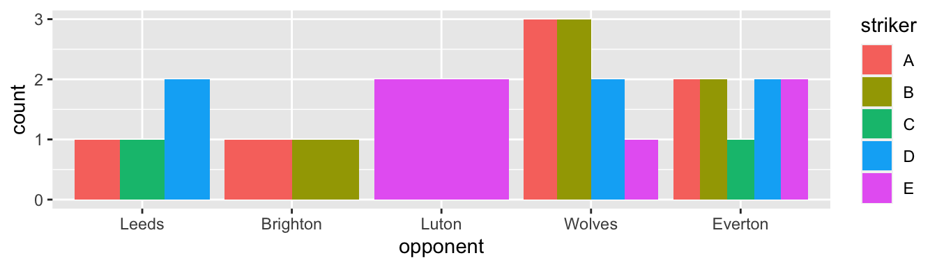
Figure 2 shows how many goals each striker scored against each of the main opponents. The case in point is to offer an alternative to Figure 2, using facets [facet_wrap()].
Install the following packages [install.packages()] if they are not present in your machine.
library(tibble)
library(ggplot2)
library(ggthemes)tibble()].
{ggplot}. I’m using it below only for an aesthetic suggestion, so no real need.
The plots below use a random data set created as follows.
set.seed(42)
teams <- c("Leeds", "Brighton", "Luton", "Wolves", "Everton")
teams <- factor(teams,
levels = teams)
df <- tibble(
striker = sample(LETTERS[1:5],
26,
replace = TRUE),
opponent = sample(teams,
26,
replace = TRUE,
prob = c(0.1, 0.1, 0.1, 0.35, 0.35)
))42 as the seed because 42 is the answer to the ultimate question of life, the universe, and everything.
factor()] with the given levels.
tibble by hand.
sample()] 26 of the first 5 capital letters [LETTERS[1:5]]. Of course, some must be repeated.
prob()].
I first recreate Figure 2.
p1 <- df |>
ggplot(aes(x = opponent, fill = striker )) +
geom_bar(position = position_dodge())
p1p1: pipe the above df into the ggplot() function.
x axis and the color of fill.
position_dodge() puts the bars next to one another, instead of stacking them.

An obvious problem with Figure 3 is the variation of the bars’ widths. Here, the problem is surprisingly with the package: Excel does not make it that bad.
p2 <- df |>
ggplot(aes(x = opponent, fill = striker )) +
geom_bar(position = position_dodge(preserve = "single"))
p2preserve = "single" makes the trick.
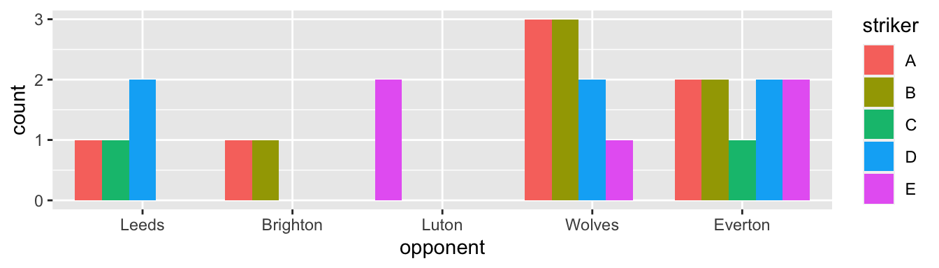
This solution is not quite satisfying, yet. Do you see why?
facet_()Notice in Figure 4 that the bars, despite having the same width, do not appear in a fixed position—i.e., the strikers do not always appear in the same order because the plot drops strikers who did not score against an opponent. One may think that the colors are “there for that”, for distinguishing the strikers. But I still find it confusing.
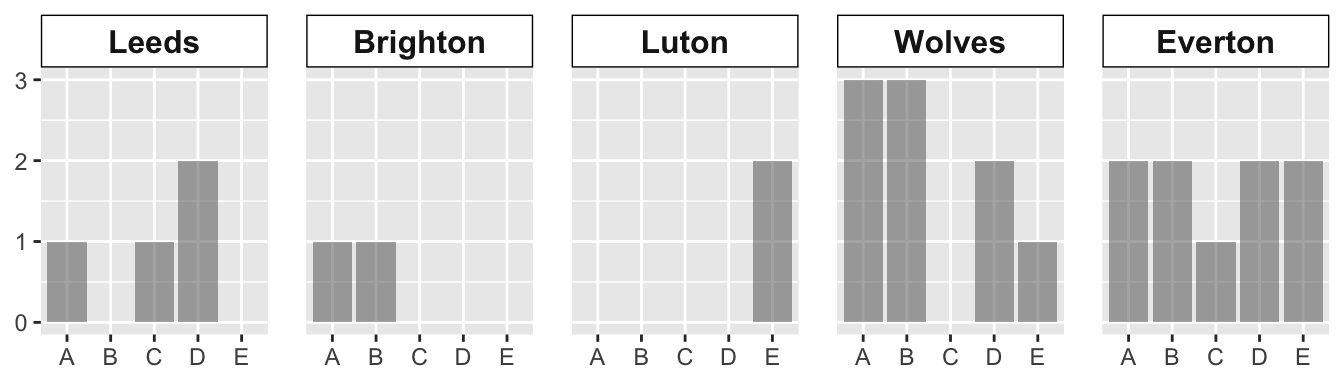
Enters the facet() function. This function will allow us to create the same plot for each level of the categorical variable, as in Figure 5.
p3 <- df |>
ggplot(aes(x = striker, fill = striker )) +
geom_bar(position = position_dodge() ) +
facet_wrap(facet = vars(opponent),
nrow = 1)
p3facet_wrap() is used because I only want to subset the data in one categorical variable [vars()].
ggplot() would probably divide the facets into two lines, which I find less appropriate for comparisons.
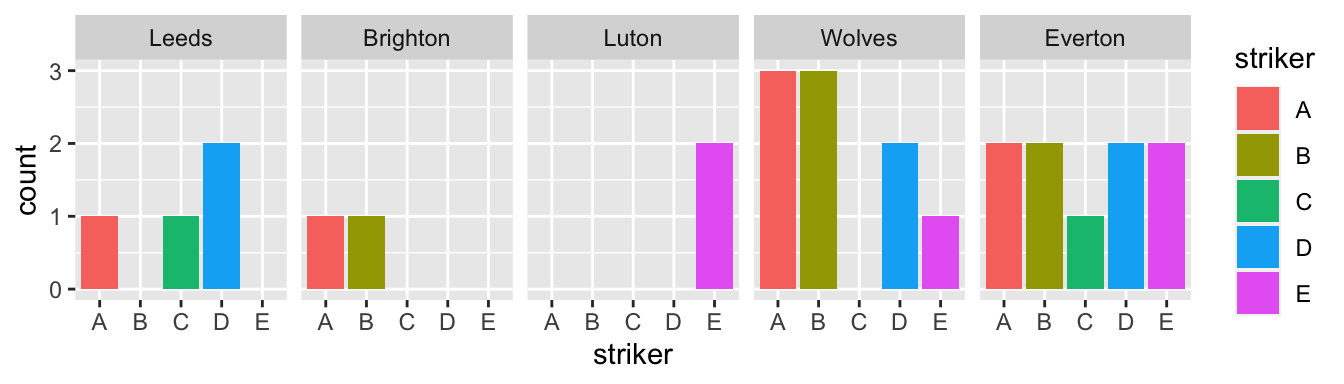
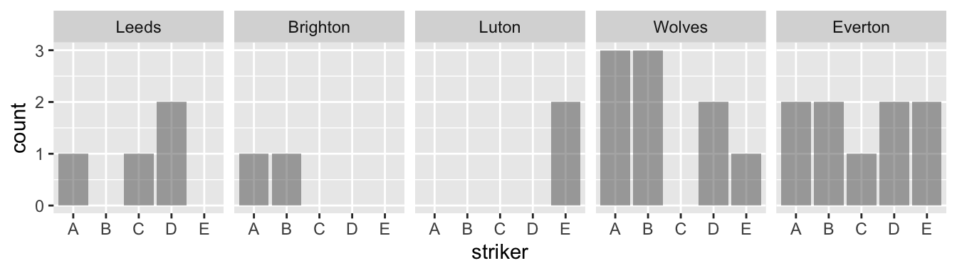
With facets, I find that the color mapping becomes redundant since we already identify the striker on the x-axis.
p4 <- df |>
ggplot(aes(x = striker)) +
geom_bar(position = position_dodge(),
alpha = 0.5) +
facet_wrap(facet = vars(opponent),
nrow = 1)
p4fill mapping anymore.
alpha argument sets the transparency of the color. The default, 1, is too dark for my taste.
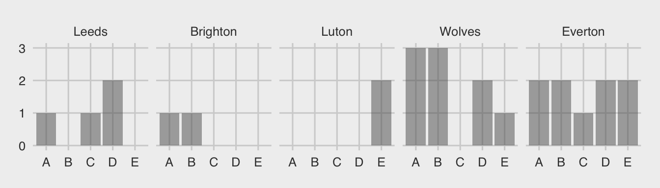
Want to see how the plot looks like under different theme options? Here is an example. In particular, appreciate how easy it is to change so much a plot with a single line of code. Careful, do not be driven away by the simplicity and start using multiple themes in the same document!
p5 <- p4 +
theme_fivethirtyeight()
p5 +] new code to it.
{ggthemes}.
As you know, every part of the plot can be customized. I dot encourage to pursue the elusive quest for the most “beautiful” plot. But sometimes some changes are required for your publication. These are generally obtained through options of the theme [theme()]. I offer a few examples here specifically related to the facets. Notice that the plot actually becomes less beautiful.
p6 <- p4 +
theme(axis.title = element_blank(),
strip.text.x = element_text(size = 12,
face = "bold"),
strip.background = element_rect(fill = "white",
color = "black"),
panel.spacing.x = unit(1, "lines"))
p6 +] code.
element_blank()]. Not specific to facets.
element_text()] to a bigger size and to bold face.
fill—inside—and a color—border—for which the color can be changed.
panel.spacing.x] between the facets on the horizontal axis.